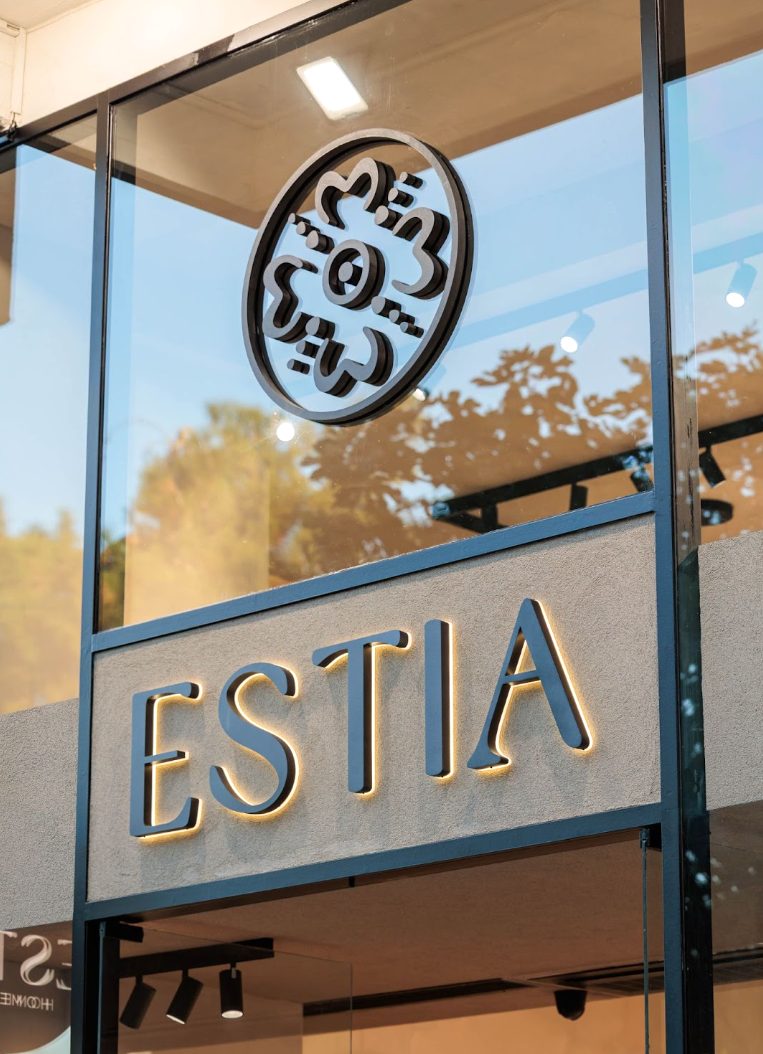
A design-led home living brand.
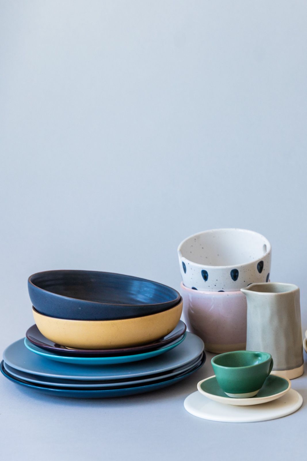
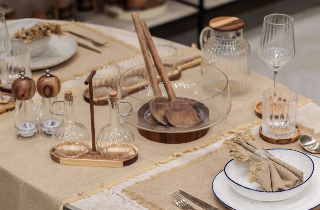
Dinnerware, kitchen and home. Objects made to earn their place in the everyday. Beautiful, useful, and built to be reached for again and again.
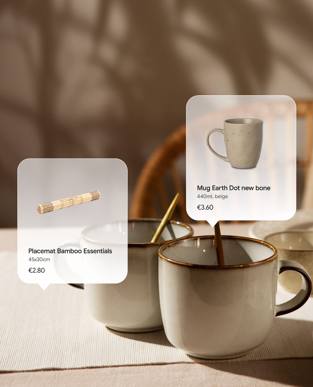
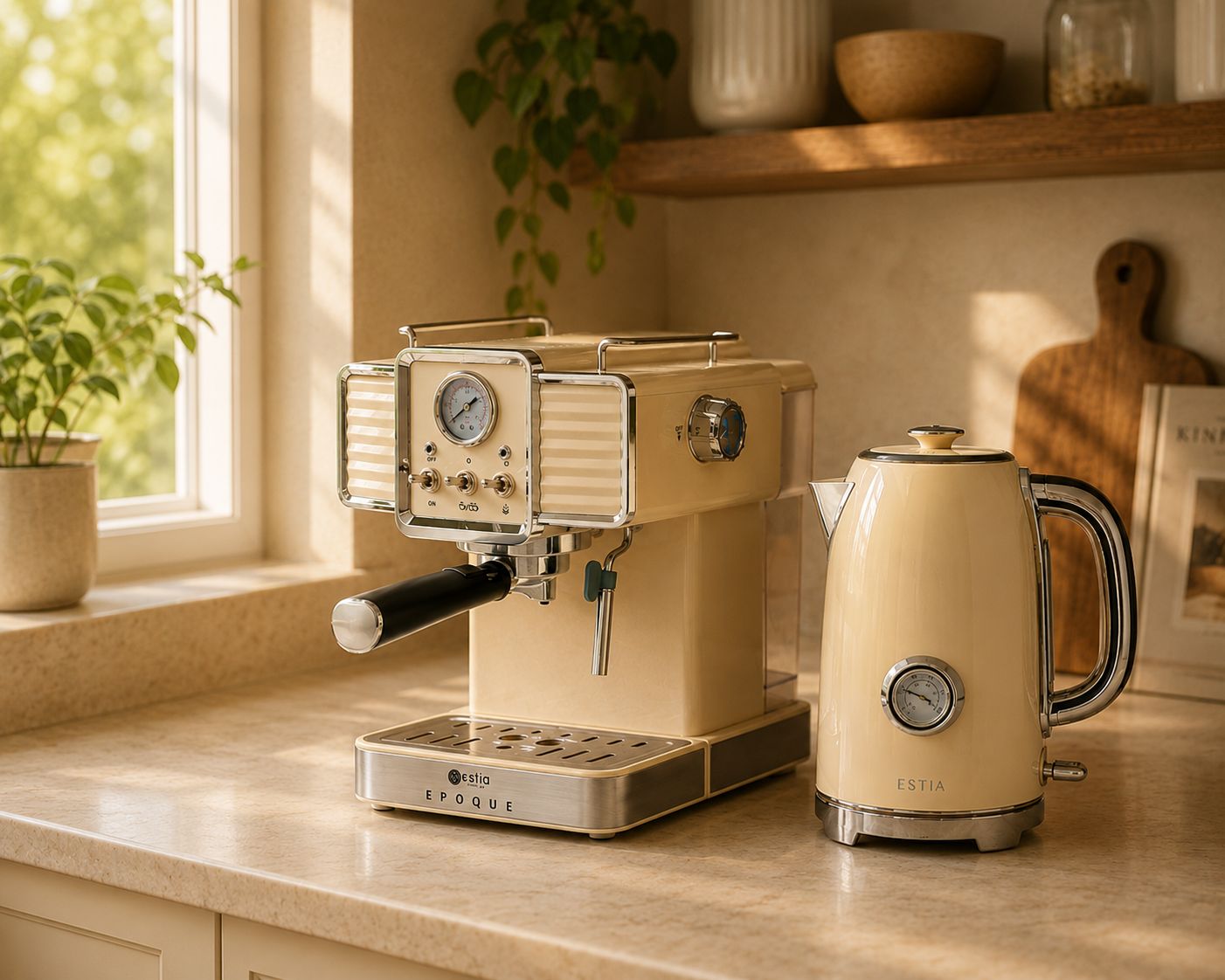
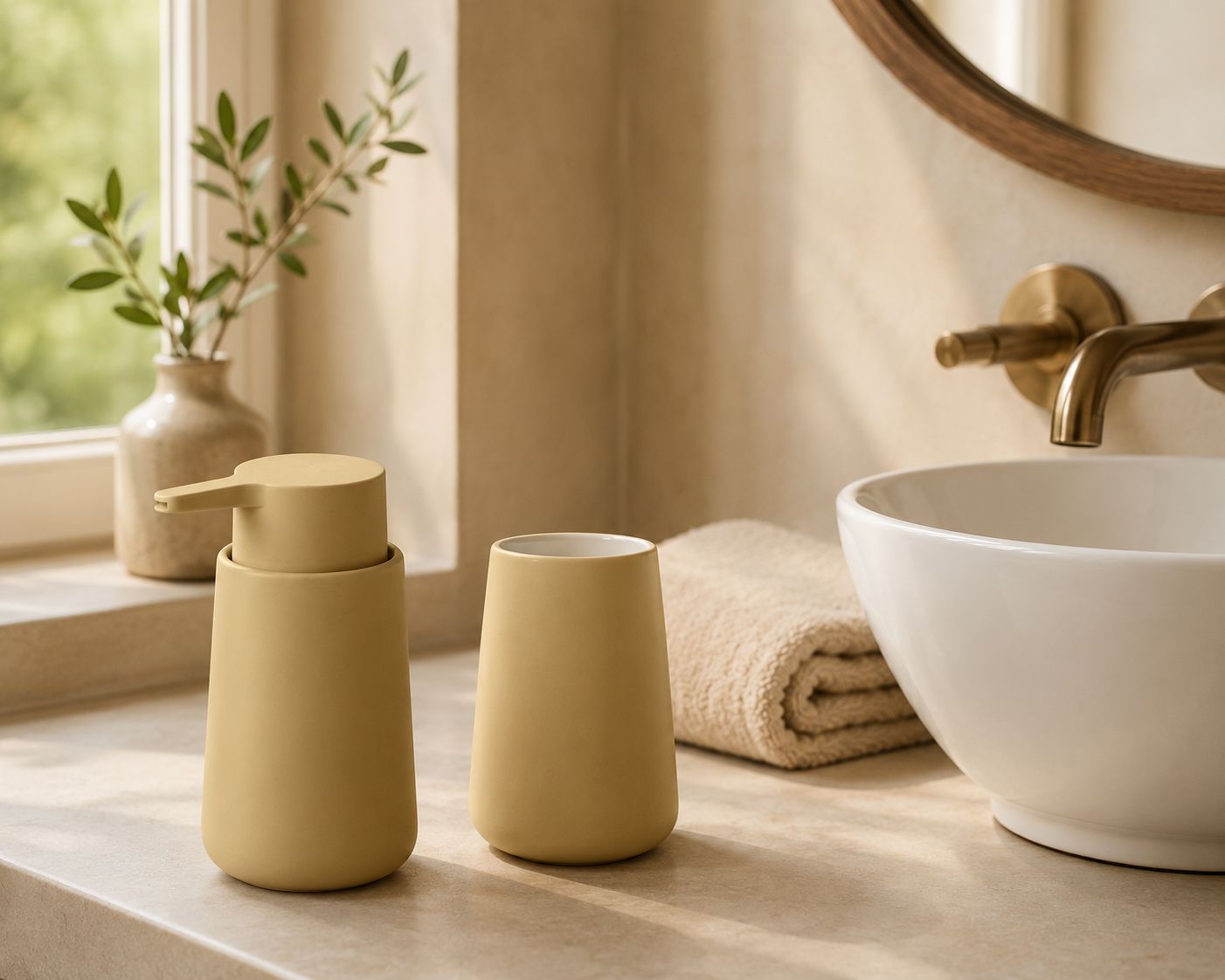
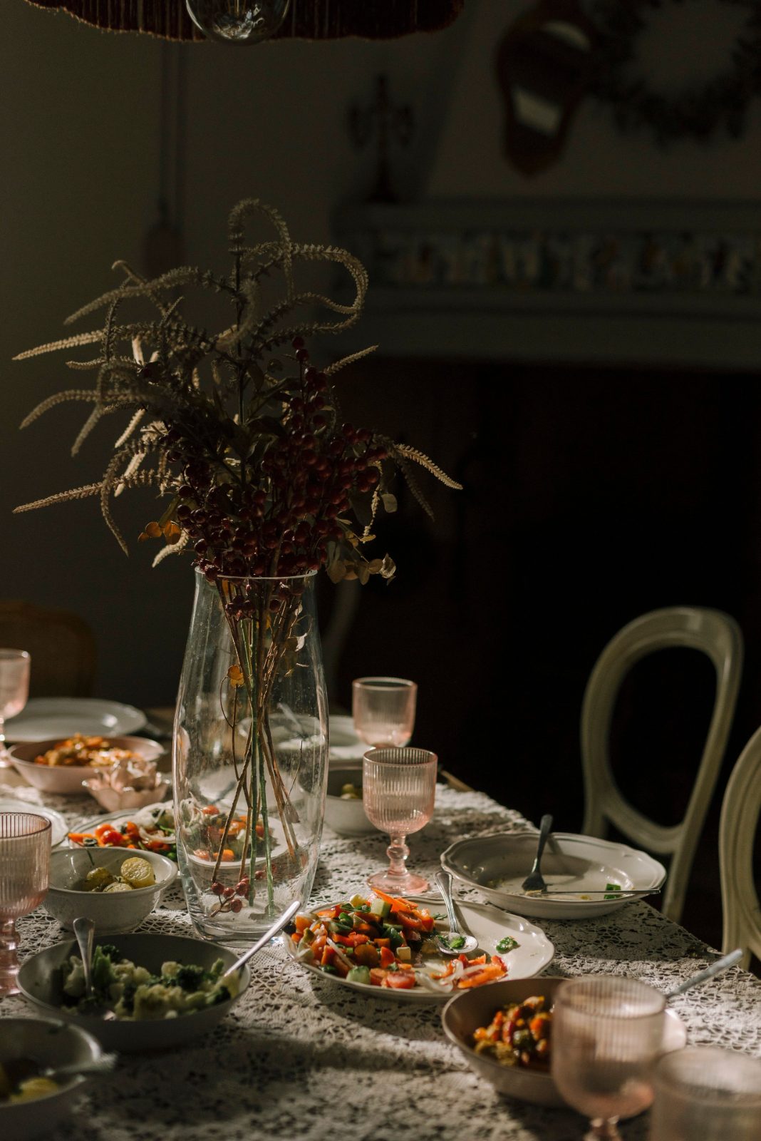
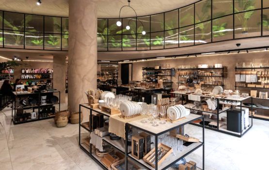
The home world is quiet and earthy: warm stoneware, natural materials, tones that settle into a room and stay.
Strong wholesale roots, now scaled into retail.
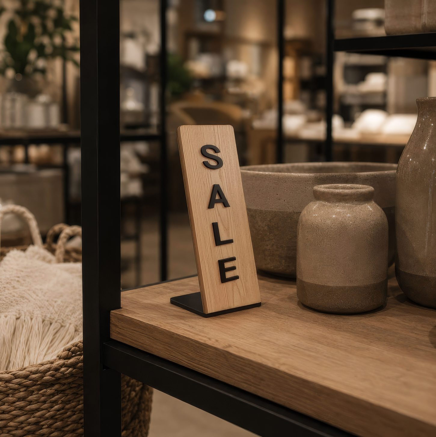
Estia grew up in wholesale, earning shelf space across the country before opening its own doors. Today it runs a balanced retail and wholesale model, with production and logistics kept firmly in-house.
Drinkware, in full colour.
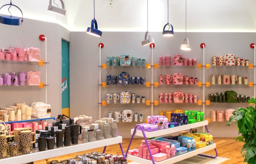
Save the Aegean is Estia's flagship: bold, playful and expressive, with a visual world all its own. Where the home lines stay earthy and calm, drinkware turns the volume up: pattern, colour and personality on every bottle, tumbler and flask.


From wholesale success to a brand people love.
Proven at scale
Product-market fit, already earned. Millions of pieces
in daily use across Greek homes.
Closer to the people who use it
A direct relationship with customers, no counter in between. Knowing them, and being known.
Building something lasting
Unlocking margin and brand equity, turning everyday objects
into a brand people return to.
A design-aware shopper, and the moments she buys for.
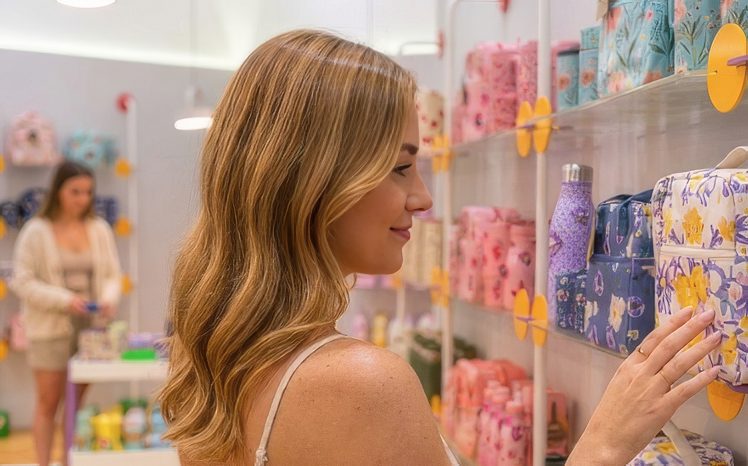
Estia's customer is largely a woman aged 18–54, living an urban, active daily life. She values good design, everyday practicality and the small upgrades that make a home feel considered, and she shops across three distinct moments.

Differentiation vs the competition.
Estia sits in the gap the market leaves open: better value than the premium brands, more design credibility than the value players, and more genuine everyday function than either.
Better price / value
More design-led
More functional
How the strategy shapes the design.
Every strategic pillar has a direct consequence for how the website looks, feels and behaves. This is where the brand plan becomes design decisions.
A home-focused retail unit for a female shopper
Warm, earthy tones and editorial serif typography set a calm, home-living tone: confident and welcoming rather than loud, speaking directly to a design-aware shopper.
Design-led, yet accessible
and practical
Generous imagery and product-first layouts show the design quality, while clear pricing, plain language and fast paths to buy keep it approachable, never premium-precious.
Drinkware as a colourful world of its own
A dedicated, high-colour drinkware environment breaks from the earthy palette, letting Save the Aegean express its personality without diluting the calm of the home lines.
Gifting, bundles & short-stay equipment
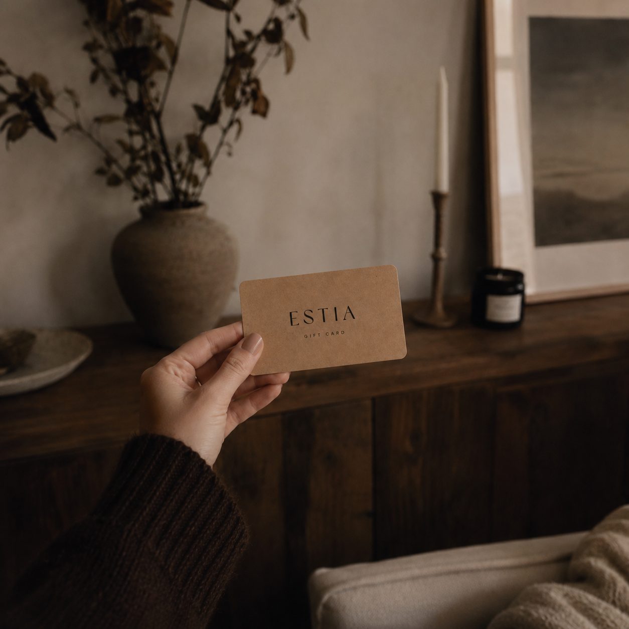
Gift cards, curated sets and combos are surfaced as first-class entry points, with bundling logic built into navigation and product pages, not buried in a category tree.